Project
INTRODUCTION
Purpl Disabled Discounts is an award winning UK start up founded by entrepreneur and disability advocate Georgina Colman.
Built with the disabled community in mind, Purpl’s website and app connect the 1 in 4 people in the UK living with a disability to exclusive discount codes and offers from over 100+ partner brands and national retailers, including Morrisons and Ocado.
By offering savings on everyday spending, Purpl helps offset some of the extra costs that come with living with a disability. Helping make their pennies go further - so they can enjoy more of the good stuff.
Brand story
In 2024 Georgina was out shopping, when at the checkout she was asked if she had any discount cards. It sparked a thought... why isn’t there a universal discount card for those living with a disability? After all, schemes already exist for students, NHS workers and Emergency Services personnel.
The idea for Purpl was born. Just two years later, that idea has grown into an award-winning brand, helping more than 90,000 members of the disabled community access meaningful savings and offset the extra costs of living with a disability.

Brief
Create a bold, simple identity that celebrates the diversity and vibrant personality of the disabled community - designed to be ultra-accessible for people of all disabilities.
It should be easy to use for those with disabilities, while capturing the feel-good moment of saving money through the Purpl Disabled Discounts platform and the positive impact it has on their lifestyle.
Outcome
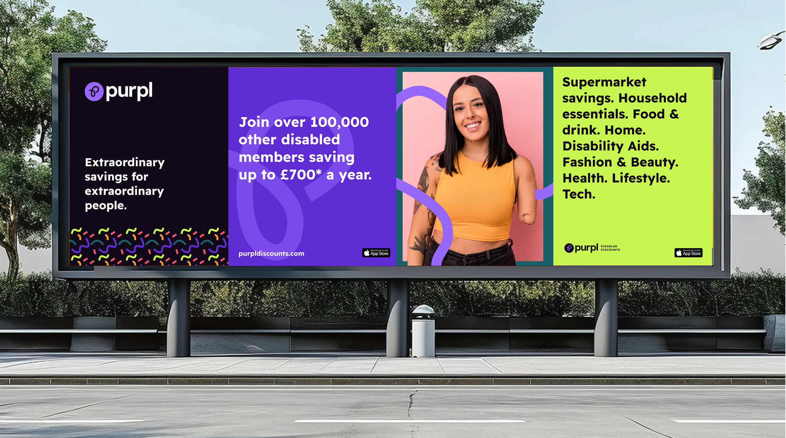
We responded by creating a bold, modern and uplifting visual style - deliberately designed to move away from the negative disability stereotypes and bland aesthetics.
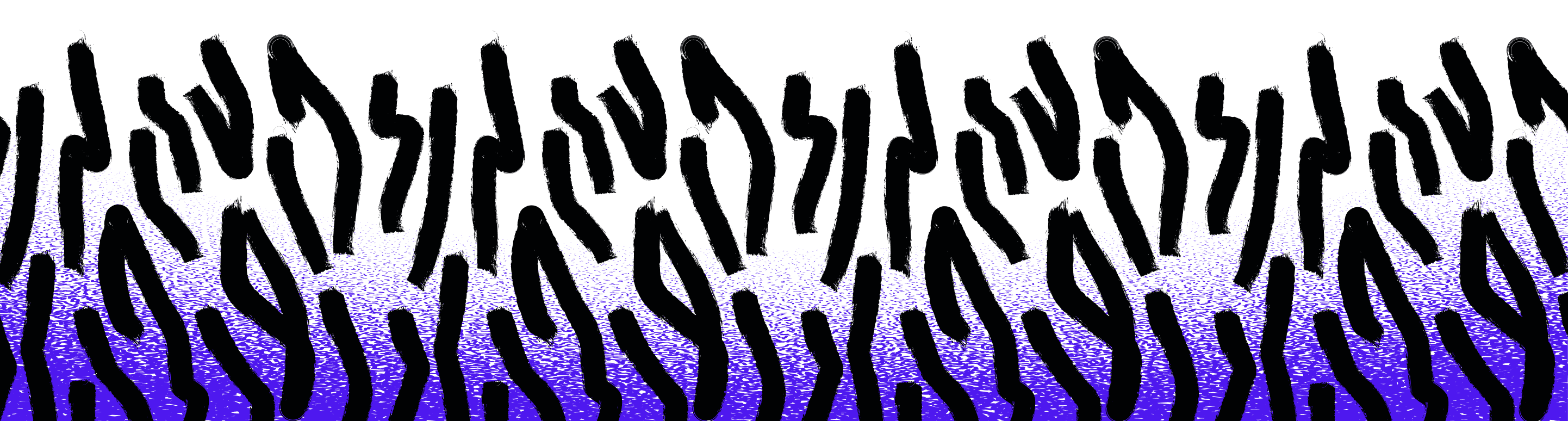
At the heart of the identity, a simple but distinctive idea of ‘stretching the pennies’ - the concept coming to life through flexible, stretchy lines that run throughout the visual system. Paired with highly accessible colours and typography, the design makes the brand vibrant, memorable and easy to engage with.
The visual identity carries through the logo, creative assets and UI, creating a consistent and flexible brand eco-system that gives Purpl the freedom to evolve and create new visual elements as it grows in the future.


Logo Design
The logo brings the brand to life through the stretchy line, shaped to form the letter ‘P’. The distinctive mark is paired with the core typeface word mark and the brand’s signature colour, creating a flexible, digital friendly, logo and variations that work across the brand touch points in the digital landscape.